The benefits of good site Development and Optimisation.
Louisa Coffee is a large national Taiwanese coffee company with hundreds of locations across the island (489 as of 2019). They are a common site in most cities and commonly used by workers and students as a place to socialise, work and study.
As a regular customer at Louisa Coffee, I visited their website to find that the English version was probably underperforming compared to their native mandarin site.
It seemed like a good opportunity to show the capabilities of Webflow, the benefits of a Webflow development from a user experience perspective as well as from an SEO perspective, and serve as a useful case study with a familiar Taiwanese brand.
I reviewed 24 web pages on the English version of their site and identified a number of issues. I've broken down all the design points as well as the benefits expected from my design and SEO decisions.
DISCLAIMER — I want to point out before going any further that this is not intended as a judgemental or disrespectful review of Louisa Coffee as a company. I love Louisa Coffee; convenient locations, professional staff and great products & services; in fact I'm a loyal customer! This case study is purely an example of how their site can be improved from a build and search engine optimisation perspective.
You can visit the original English Louise Coffee website here for reference.
What's the problem with their original site?
For a nationally recognised coffee chain, the English version of their website has some clear issues that need to be addressed. it's probably worth pointing out that this is a Taiwanese company, so naturally their focus will be on the Mandarin version of their site.
However they have gone as far as creating an English version, so it should in theory perform just as well as their native site. There are a large number of english speaking foreigners residing in Taiwan (myself included). I visit a Louisa location several times a week to buy a coffee, a snack and use their wifi and workspace to get on with some of my own work. Here's an overview of the issues I identified across their website.
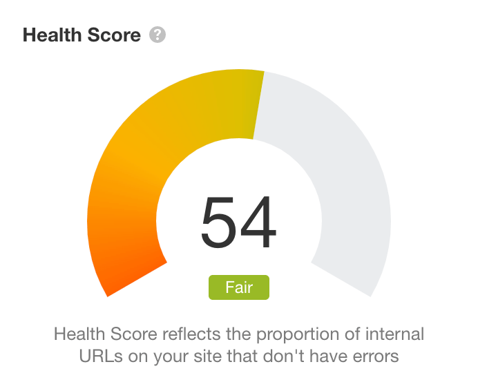
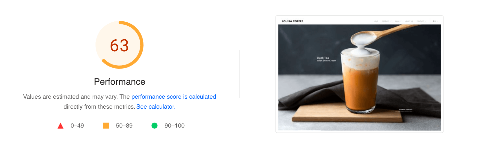
Overall site health was 'fair'. I use software to crawl websites and identify all issues across the web pages. After a scan of their website, the result came back of 54 out of 100, with a large list of on-site issues that needed to be resolved.
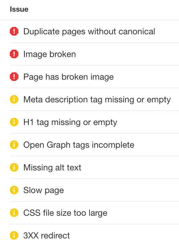
Here's a breakdown of some of the issues identified that needed addressing:
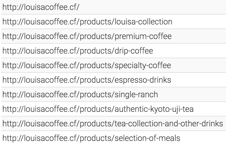
URL’s not optimised
Unfamiliar or illogical words in a URL are unhelpful for the visitor and a disadvantage for SEO. The best practice is to match the URL with the Title of the web page, ideally with the targeted keywords also featuring.
Title Tags not optimised
All web pages had the same Title Tag: LOUISA COFFEE. These should be customised for each specific page to help Google serve them appropriately based on a user’s search query.
Missing content
On several pages, there was content missing within the layout. While search engines won't pick this up on 'missing content', as the user most definitely will spot this, it will impact User Experience (UX), resulting in a higher bounce rate, which will impact SEO so it's worth resolving if possible.
Duplicate content
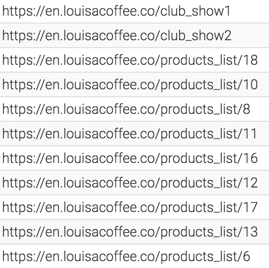
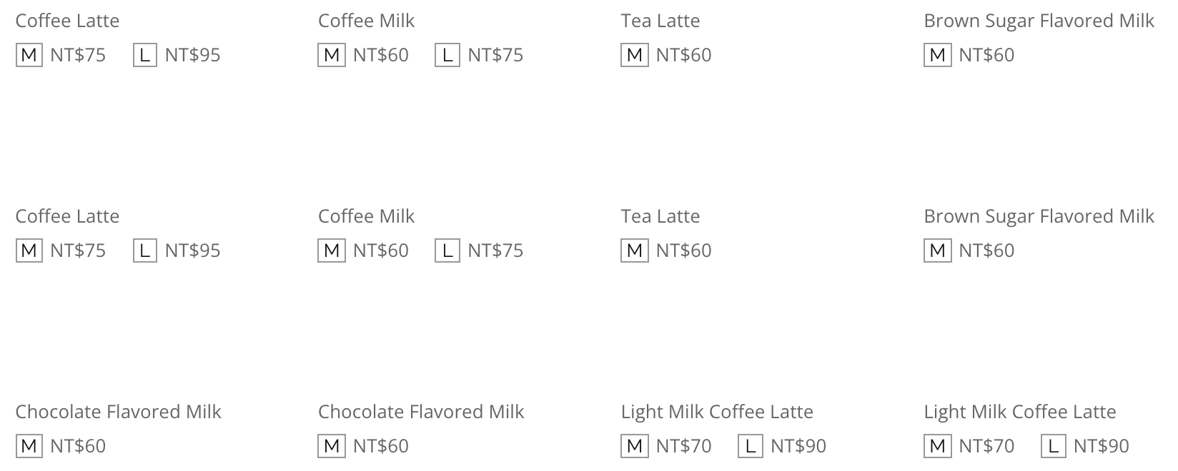
While there was sections with content clearly missing, there was also several sections with duplicate content. For the same reasons as missing content, this is bad for overall UX and must be removed. You can see below as an example, that 8 out of the 12 products listed on the original Single Ranch page were duplicated.
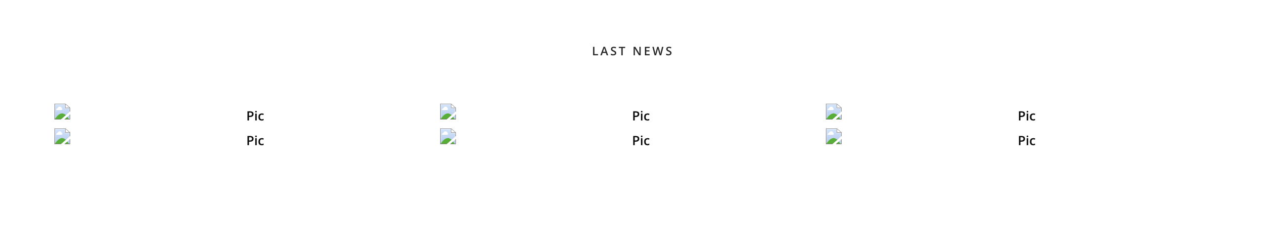
Broken images
Broken images will show a small image icon with a rip though it. Several broken images appeared on the home page. Again this is bad for user experience and overall site health.
Page speed
It’s well known that page speed is a ranking factor for Google and also has a large influence on whether a user will get onto the site and stay on it.
Design inconsistency
It appeared that a lot of the web pages had been designed independently from each other, not following a uniform style guide that could be followed consistently throughout the site.
The solution
Recreating the site with Webflow, I’m able to address and resolve all the issues mentioned above.
You can visit the rebuild of the Louisa Coffee website here for reference.
I purchased a similar domain to make this redesign look as professional as possible, then created a new URL structure for the web pages that are relevant for the content on the pages. I've effectively recreated their website design, with a few minor changes when necessary to keep the styling consistent and clean.
I'll dive into some of the design and build aspects and my thought process for each part.
Best responsive design
For the Louisa Collection page, I condensed the sections into columns to neatly separate the information. However when viewing the mobile version I wasn’t convinced this was the best choice display. To solve this, I created 2 columns of each section, with one showing the best desktop design and one showing the best mobile design.
I then created separate classes for these sections so only the desktop design would be viewable when the site was displayed on desktop, with the mobile-class section set to hide. With this logic I also set the desktop-class design to hide when the site was displayed on mobile.
I think this is a fairly simple solution to keep the best design displayed depending on the device being used, allowing for the best user experience possible.
Blog links
I noticed that in the Footer section, the links to the blog articles had no visible interaction when hovered over. This can be confusing for users as they don’t know if they are active links or just text.
To solve this I added a simple hover interaction that is used on other active link texts across the site, with a underline appearing when hovered over, making it clear these are interactive links.
Simplifying navigation
In order to make navigation simple while easy for users, I decided to restructure the breadcrumb links across the headers of each page.
They originally listed the Home page, before the sub folder followed by the actual page being viewed. But as there was already a Home button in the navigation, as well as the standard clickable logo on the left on the navigation directing back to the Home page, I decided the breadcrumb links did not also need to list the homepage link. This uncluttered the links listed in each page header, without removing the ability to easily return to the homepage.
Need some support?
✔️ Improve your Google ranking
✔️ Understand your site performance
Premium Coffee page
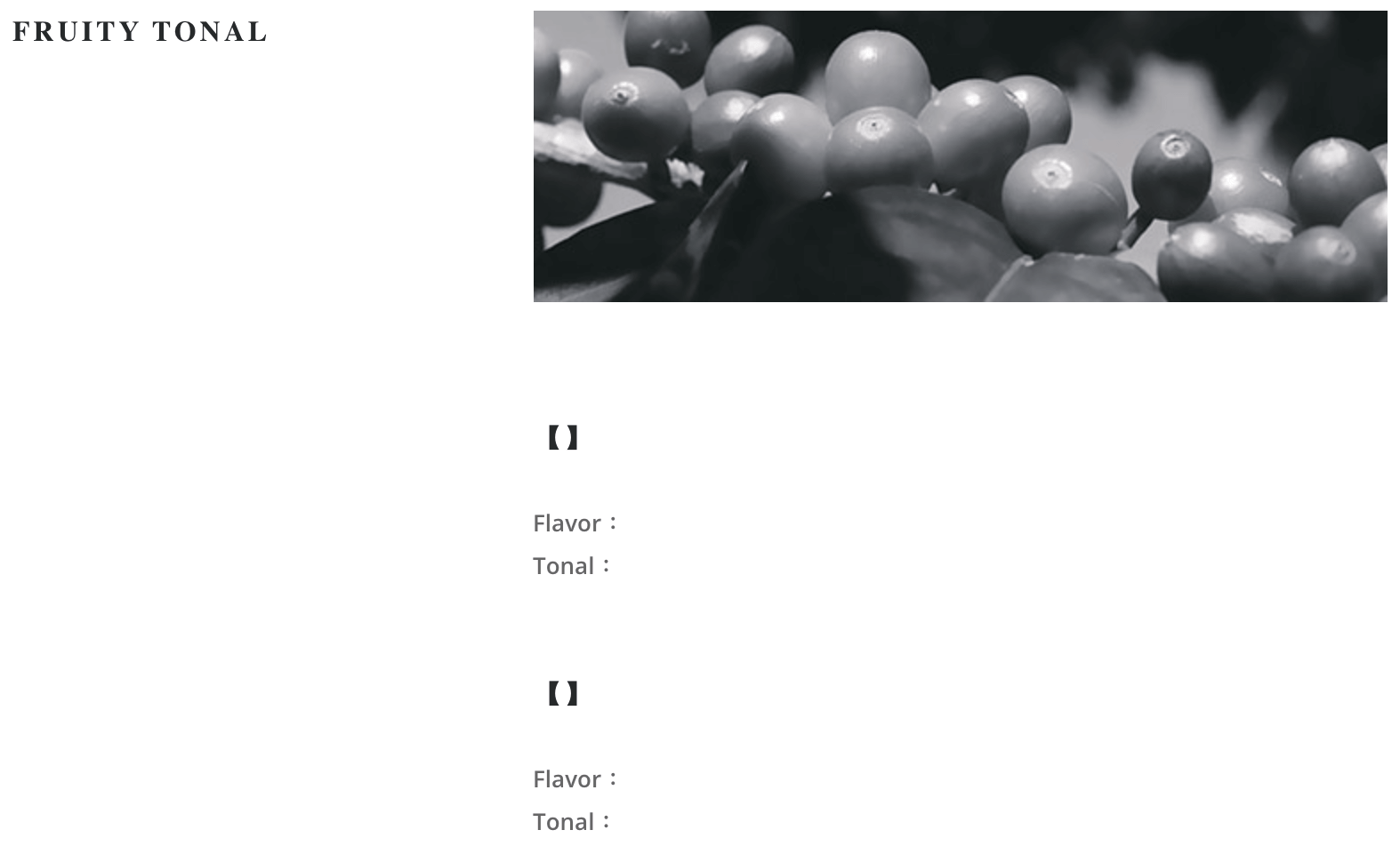
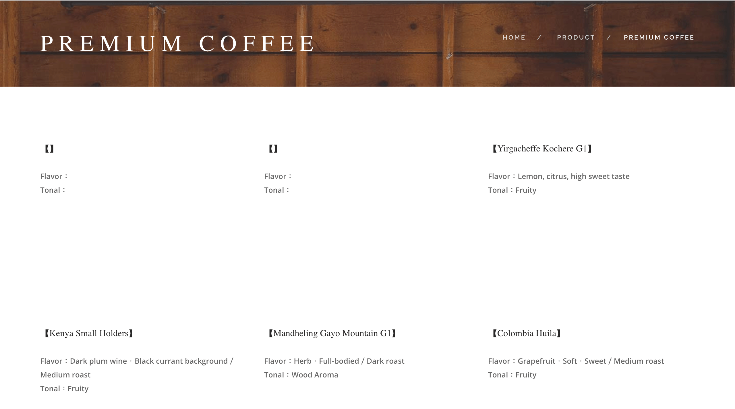
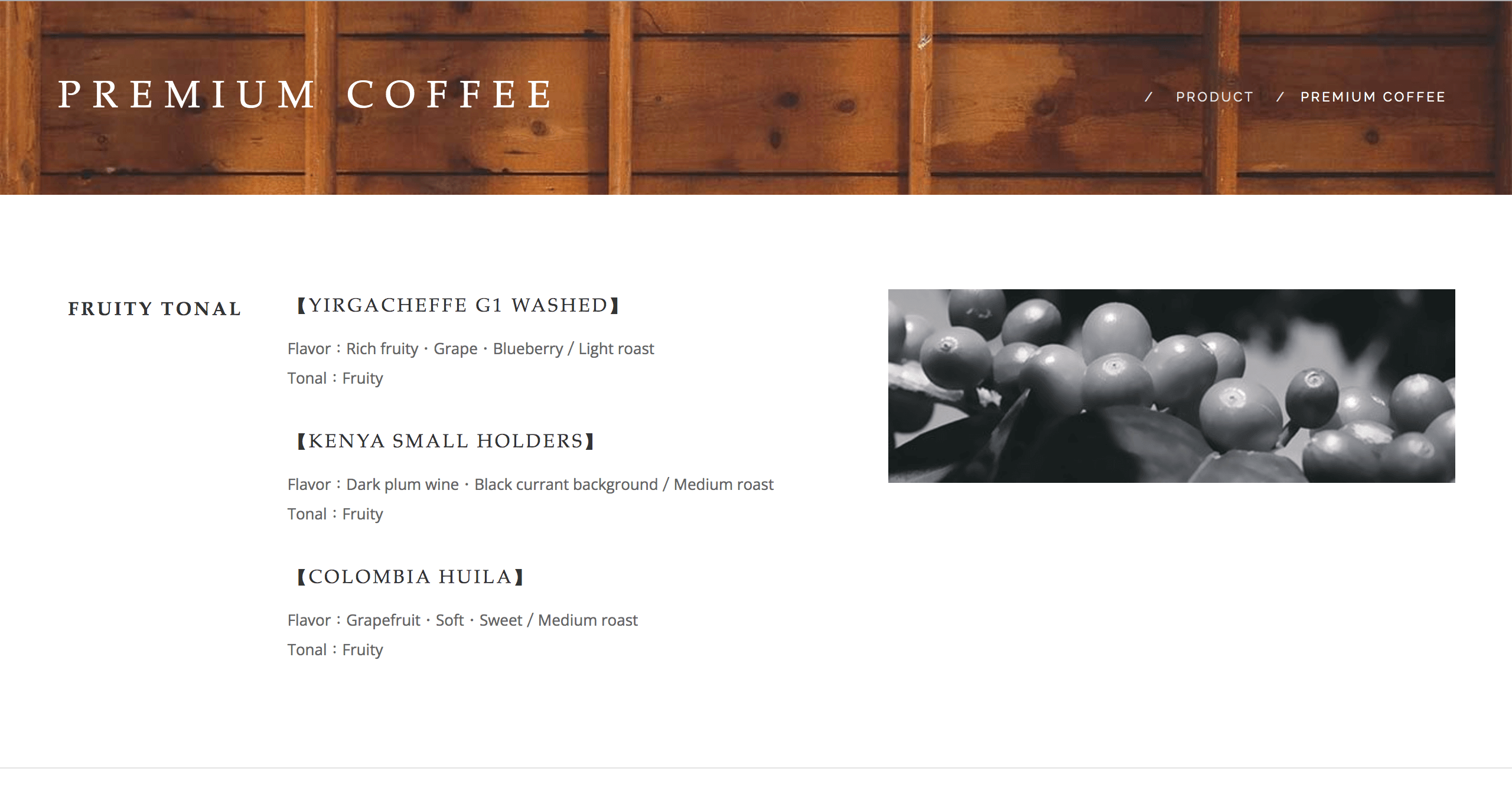
The Premium Coffee page had a larger collection of coffees available than the Louisa Collection page, but zero images. With this in mind I decided to group the products together based on tone, as was the same logic on the Collection page. This was I could reuse the same images, giving the page a more aesthetic feel with some images as even though they were the same images, it still made sense to display them illustrating the tone differences available.
Old Louisa Premium Coffee page
New and improved Louisa Premium Coffee page
Simplifying Content
As there was a large amount of duplicated content, especially across the product pages, removing the duplicate content reduced the overall text on a lot of pages, giving a much cleaner finish.
Duplicate content removed
Meeting Cakes page
This page had only one image and no information relating to the product, so I decided it was best to leave it from the site for the time being, unless information became available on the product, in which case I could add it at a later date.
About Us page
One thing I noticed on this page was that the first body of text was in Helvetica font, which is the first and only appearance of this font across their website. It seemed like a bit of an irregularity, so I decided to switch to Open Sans which is frequently used across the site, keeping this with the styling of the whole site.
The layout was also a bit intense; a large block of text. It’s common practice to break up large chunks of text into smaller, more legible bitesize pieces as its easier for the reader to absorb.
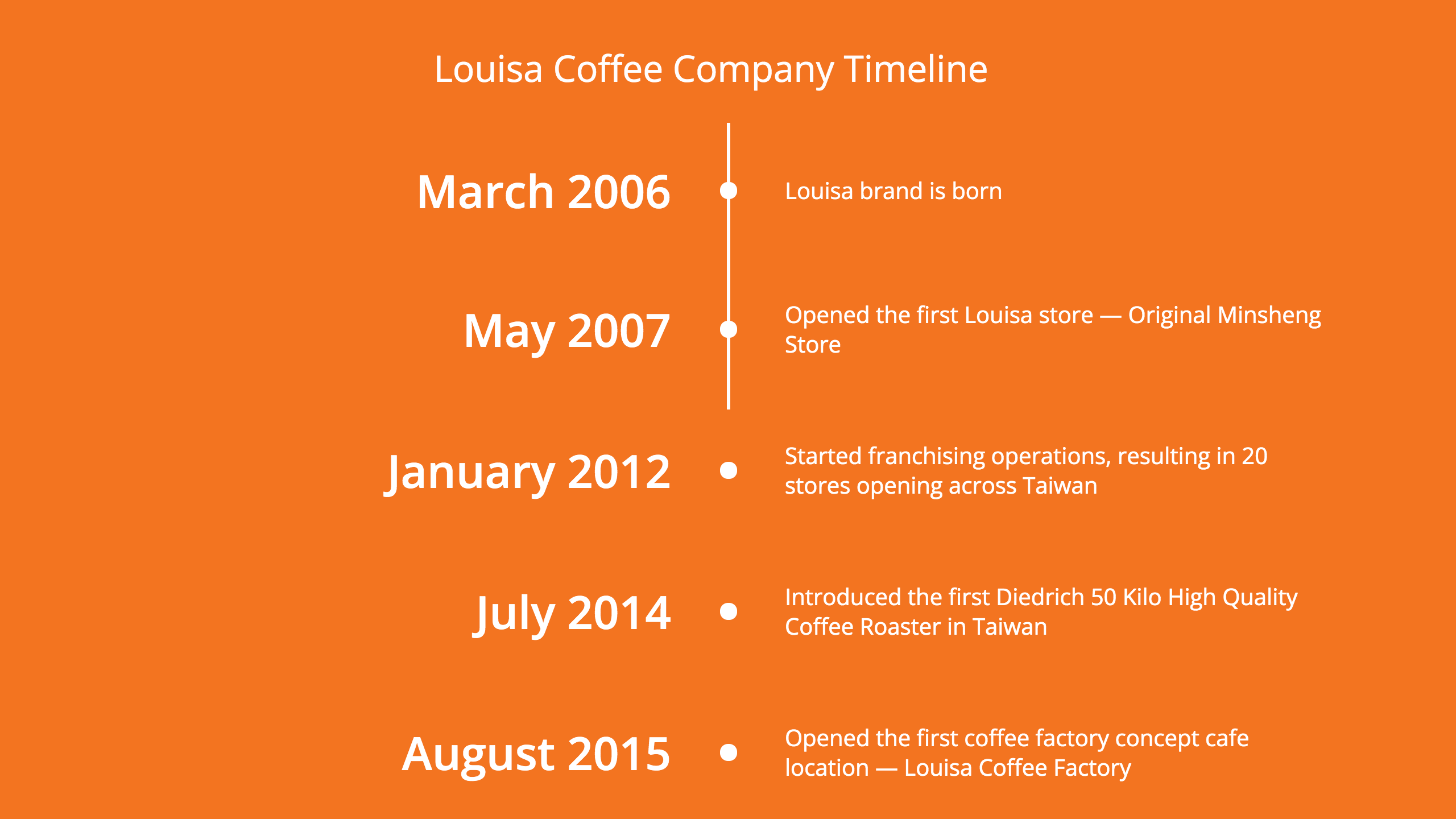
The same issue appeared with the Timeline. It was just a long list of dates and events with no way to distinguish between each. So I created a more visual timeline that will illustrate the progress of the company over the years as the user scrolls down the page.
This layout makes the dates much more distinguishable and the event related to the date easy to read and digest. You can go and view the interactive timeline on the About page here.
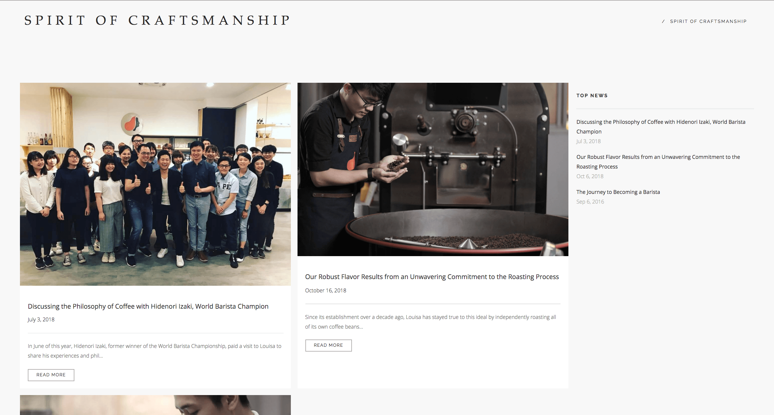
Blog category pages
There are two categories of blog posts; ‘Spirit Of Craftsmanship’ and ‘For Life’. These two category pages had a completely different layout, with the first having a blank template before the blog articles appearing below this.
I made these a uniform layout following the design of the ‘For Life’ page for consistency and ease of use.
Old Louisa Blog layout
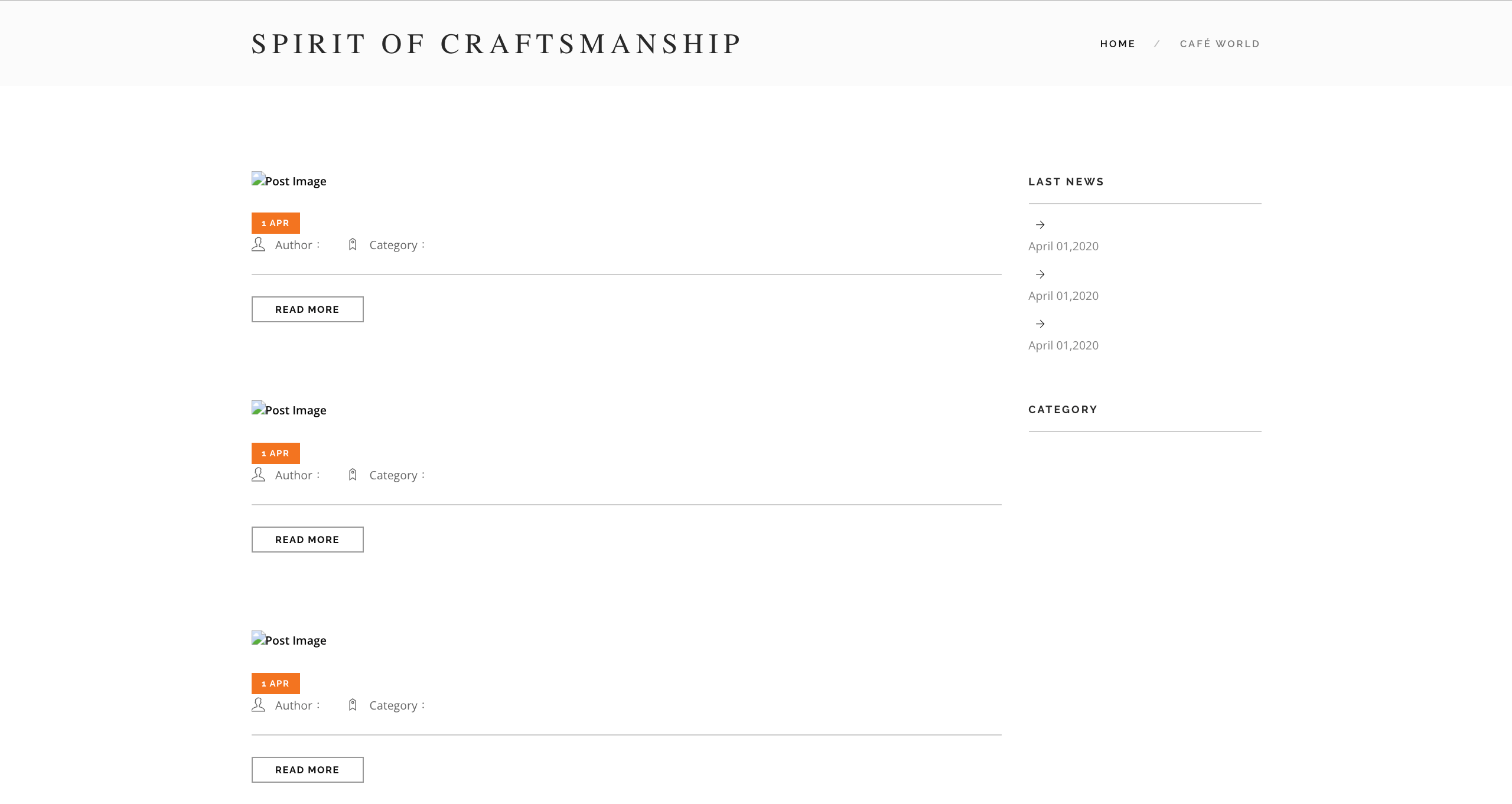
New and improved Louisa Blog layout
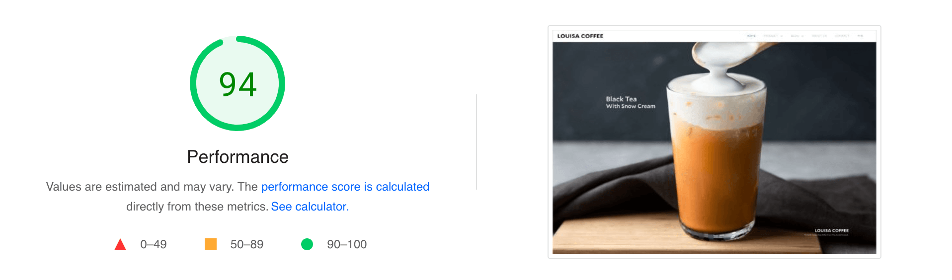
Google Speed Test
As mentioned above, the speed of web pages is a well known ranking factor for Google, and slow sites can impact dwell-time (time spent on site by the user), overall bounce rate, or users completely abandoning their attempt to access the site if it is not loading fast enough. I use a high performance hosting provider on all my sites, and you can see below the difference (in case you missed it above, the original site speed test result was 63).
The results
The results of the rebuild are a more modern, cleaner finish across the site, which is easier to navigate and more pleasing for the user to use, equally longer time spent on the site, a lower bounce rate, and more contact/lead opportunities.
User Experience (UX)
The user experience is something that will be tough to measure as this redesign will likely get low traffic, however I've followed best design practices to keep it as aesthetic for the user as possible and the branding has been much more consistent throughout the site. The proof is in the pudding, so I would invite you to go to the newly designed Louisa Coffee site and check it out for yourself! If you have any questions, thoughts or feedback, I would sincerely appreciate your comments; get in touch here.
Search Engine Optimisation (SEO)
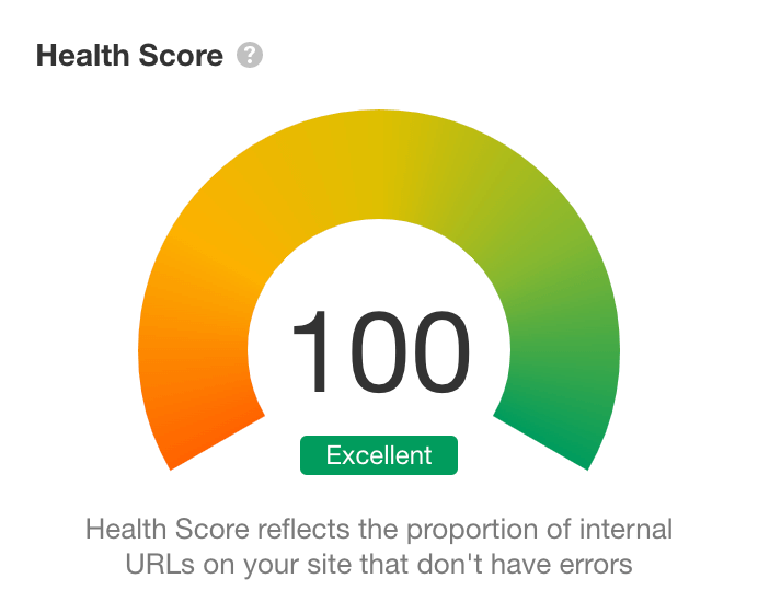
Following best practices across the on-site build, the site health of the new build has achieved the highest possible score. It should be noted that this is purely on-site SEO, which is only one aspect of overall optimisation. However it's an essential part and will be recognised by Google as a professional and fully functioning site serving the users who visit.
Summary
Whether you're a nationally recognised brand or a new business starting out, a professionally built website with SEO best practices followed will give you the edge over competitors and increase your digital presence, so it should be a priority to make sure that your site is built right, even if the design is beautiful. As we say, what's the point in having a site if no one is going to see it.
FULLTIME.digital are SEO experts. We know how it works, and how to make sure your business is appearing when the local community is searching for products and services like yours. Hopefully this article demonstrates the importance of a SEO as well as professional development, so if you’d like to learn more then head to our SEO Services page, or you can contact us directly here.
FULLTIME.digital build and optimise websites specific to your needs and your business. Want to get serious about your website?
Get in touch and talk to the team.